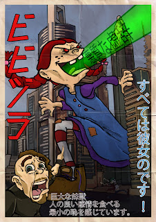
Don't bother trying to translate it! It's babelfish assisted gibberish AND I forgot to reverse it (forgot Japanese is read right to left.)
Anyways, it's Leonardo vs the Shredder in honor of TMNT Out of the Shadows
Nefarious Workshop
The Online Portfolio of R.A. Conrad, Analog and Video Game Art and Design
Monday, September 2, 2013
Monday, January 21, 2013
Embrace the Dark
These are my final submissions for the Darkstalkers character design competition. They are fairly loose and quick, and I tried to keep in with the more cartoony design aspects of the series. Anywho! Here they are! Captain Blacklock and the Mapinguari!
Tuesday, December 25, 2012
Darkstalkers Embrace the Dark
The concept sketch and subsequent costume variations of my entry for the Darkstalkers character design competition. Beauty shot comes tomorrow with some gesture sketchs for his moves and animations, hopefully a 3d model later in the week
I call him Captain Blacklock, he is a surly and scurvy spectral sealubber!
I call him Captain Blacklock, he is a surly and scurvy spectral sealubber!
Monday, November 5, 2012
A few new models for you
So the assignment for this was to create a zombie fighting weapon created out of multiple household objects. I duct taped a can of chili onto the rear of a mag-lite, jammed some knives, screws and a scredriver through it and a spork up through the top :D
With a 512x512 texture budget and a restrictive 500 tris (I clocked in at 499) I think this came out very well
The teacher gave me some feedback. My normal map clearly wasn't working, and my spec maps didn't work very well at all. He also felt the spork wasn't obviously a spork (I disagree, but he's the boss).
Took off the spork, and replaced it with zombie kill count tally marks, fixed the spec, added some minor label wear details to the diffuse, and applied the normal. The results are much better, overall.
A hatchet! I think this came out well overall, with the exception of the leather straps at the handles. I am going to redo those and resubmit this, because they look really mediocre, but I figured this is still worth sharing.
I think the normal map on the blade came out well.
Thursday, November 1, 2012
A bit of new work
If anybody knows the HTML to embed a vimeo or youtube video on blogger, please let me know. I'd like to share an animatic I worked on, and would rather not force people to follow outgoing links.
Regardless, here is the vimeo link: https://vimeo.com/52571493
Regardless, here is the vimeo link: https://vimeo.com/52571493
Just a few models, there. Nothing fancy.
Sunday, September 2, 2012
Additional Game Modeling
I modeled out my desk! It's a really simple desk with simple geometry. I did not connect the bars at the bottom because it would be out of the way of the player camera, really, and doesn't really do a whole lot while wasting tris.
A Mortal Kombat arcade cabinet. Higher tris than everything else in the scene, clocks in at maybe 1,200 with most of those being in the buttons and joysticks. I could trim it down if I had an art director that told me to, but as of right now this meets the criteria and doesn't push the tris too hard so I let it slide.
A lot of the art around the joysticks I did, trying to keep in the spirits of the original arcade cabinet but I didn't have to art, so I did my best and it came out pretty good if I do say so myself.
A room divider modeled after the bottom left ones, sort of merging the two. It's a very simple model, but I wanted this to speak with the textures and I think those came out very nice.
The diffuse map for that pac man chair has been revised, and now you can see some wear. Fixed the Spec map as well so we get some more believable reflections, but I still need to fix the absolutely insane bump map.
Sunday, August 19, 2012
How much did you miss me?
So opening up here, this is really unrelated to anything I've been doing lately but I had a blast doing it, so I wanted to share. It's a riff on the original Godzilla movie poster, it's maybe two or three hours of work, including the bad Japanese translations.
Below are some sample sheets of some work I've been doing.
This Pac-Man chair was WAY too dark and has no wear on it. I've revised it and will upload new renders soon.
That is the blockout of the room I'm working on using these props. Some of these need to be a bit taller, mainly the coffee table and arcade cabinets.
Subscribe to:
Comments (Atom)


